The same numbers, as a picture
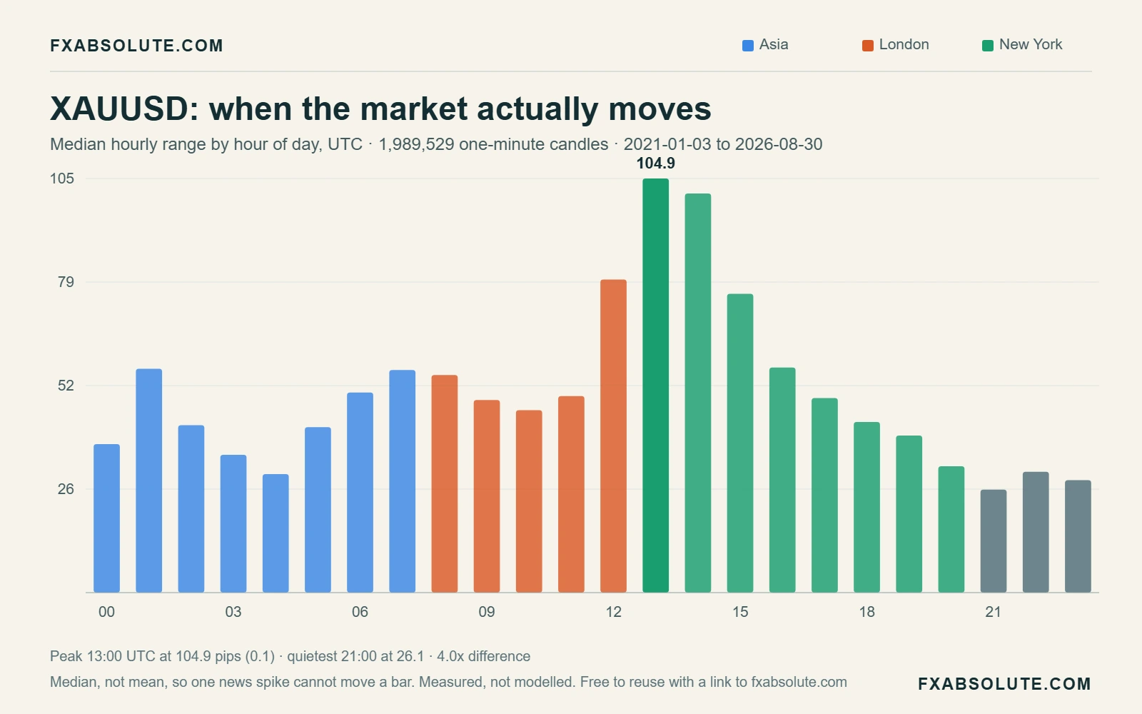
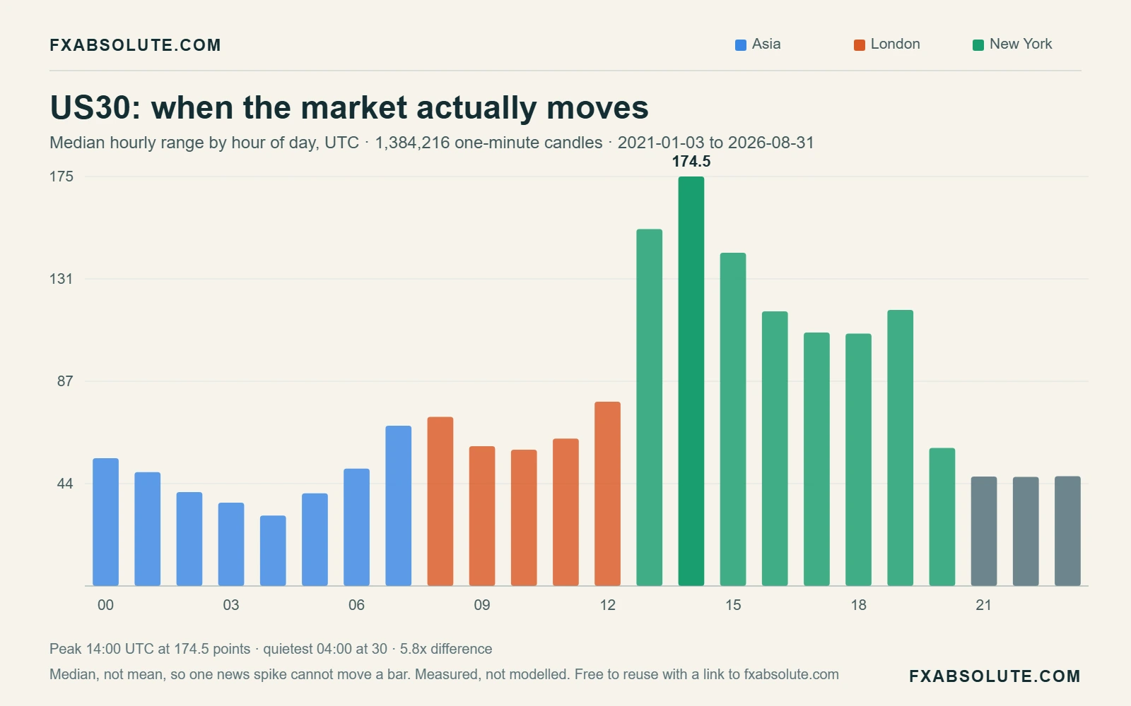
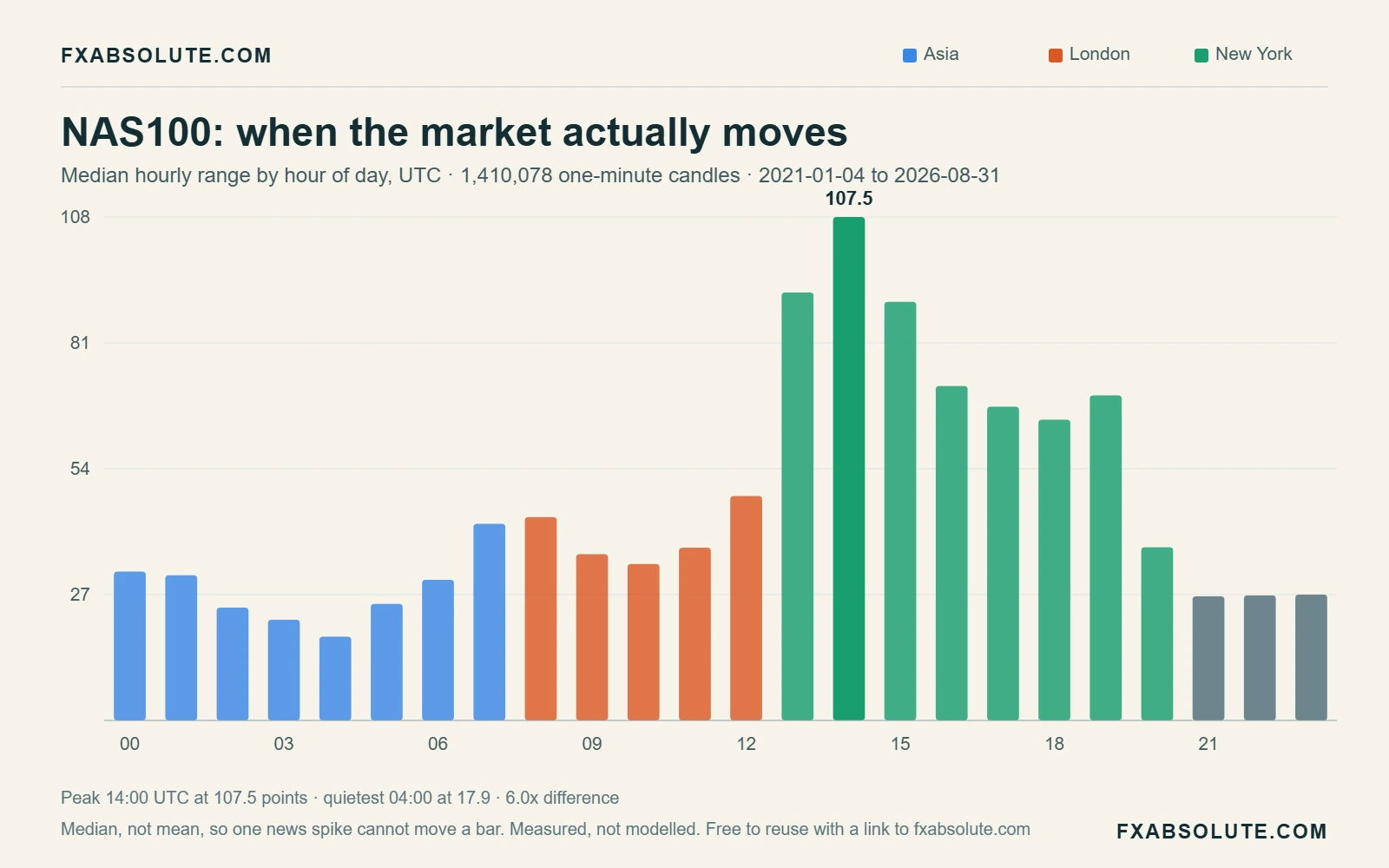
Most beginners choose what to trade and never choose when. This shows which session is open right now, and — from real one-minute history — how much gold, GBPUSD, EURUSD, the Dow and the Nasdaq have actually moved during this exact hour of the day.
It puts two things side by side that beginners almost always look at separately: which market session is open right now, and how much your instrument has actually moved during this exact hour of the day across the last few years.
The session badges are live — they follow your own device clock, in your own timezone. The bar chart underneath is not live and is not an opinion. It is the average high-to-low range of every clock hour in the archive, bucketed by hour of the day, measured in that instrument's own pips or points.
Pick gold and look at the shape. Then pick the Dow and watch the shape change completely. That difference is the entire lesson.
New traders spend months hunting for a better entry signal while trading at hours where the market simply does not move. No entry rule can fix that. If the average hour produces 50.4 pips of range on gold, a 100-pip target inside that hour is not a plan, it is a wish.
The measured spread between the best and worst hour is bigger than most people assume:
| Instrument | Busiest hour (UTC) | Avg range | Deadest hour (UTC) | Avg range | Difference |
|---|---|---|---|---|---|
| XAUUSD | 13:00 | 140.9 pips | 04:00 | 50.4 pips | 2.8× |
| GBPUSD | 14:00 | 30.4 pips | 23:00 | 9.8 pips | 3.1× |
| EURUSD | 14:00 | 24.1 pips | 21:00 | 7 pips | 3.4× |
| US30 | 14:00 | 195.1 pts | 04:00 | 38.1 pts | 5.1× |
| NAS100 | 14:00 | 122.8 pts | 04:00 | 25.8 pts | 4.8× |
The Dow moves 5.1 times more in its busiest hour than in its quietest one. Gold moves 2.8 times more. Same instrument, same trader, same strategy — the only variable changed is the clock.
There is no smoothing, no indicator and no model here. The process is deliberately boring, because boring is auditable:
Two details worth stating plainly, because they change how you should read the result. First, this is the average range, and averages are pulled upward by news days; the tool also reports the median under the chart, which is the more typical hour. Second, an hour with a big range is not an hour that trends — it is simply an hour that moves. Those are different things, and the next section is about the difference.
Three readings, in order of usefulness:
A busy hour raises the ceiling on what is possible. It does not raise your win rate. Volatility cuts in both directions — the same hour that lets you reach your target twice as fast also reaches your stop twice as fast. This tool tells you when the market is awake. It cannot tell you which way it is about to walk.
Ravi is in Dubai, so his clock reads UTC+4. He likes gold and he trades after work, sitting down at 8pm local time. That is 16:00 UTC.
He opens the clock and sees New York is open and London has just closed. The bar for hour 16 shows gold averaging around 89.3 pips of range, against a quietest hour of 50.4. He is trading in a genuinely active window — good.
Now compare his friend Ahmed, who trades before work at 8am Dubai time — 04:00 UTC. That hour averages 50.4 pips on gold, the deadest hour on the whole chart. Ahmed is not a worse trader than Ravi. He is trading a market that is asleep, and no amount of screen time fixes that.
The fix is not "trade harder". It is either to move the session, or to accept smaller targets and wider patience in the quiet hours.
A chart of averages is a starting point, not evidence about you. Load gold or the Dow in the free backtester, replay the same hour a hundred times, and count what your own rules actually produced in that window. That number is worth more than every hour-of-day article on the internet, including this one.
Backtest your trading hours free →"Session" simply means the hours when a region's banks and institutions are at their desks. There is no bell and no official switch — the boundaries below are the conventional ones, in UTC, and they shift by an hour when regions change to and from daylight saving.
| Session | UTC window | What it is known for | Best suited to |
|---|---|---|---|
| Sydney | 21:00 – 06:00 | The quietest stretch; ranges are narrow and thin | AUD and NZD pairs |
| Tokyo | 00:00 – 08:00 | Steadier; often builds the range that London later breaks | JPY pairs, patient range work |
| London | 08:00 – 13:00 | The first real surge in volume; the day's direction often starts here | GBP and EUR pairs, gold |
| New York | 13:00 – 21:00 | US data and the index open; the widest hours on the chart | Gold, US30, NAS100, USD pairs |
The overlap from 13:00 to 16:00 UTC, when London and New York are both trading, is where the tallest bars sit for almost every instrument in the list. That is not a coincidence and it is not a secret — it is simply where the participants are.
Once you know when to trade, the next question is where to put the stop — and that has an equally measurable answer. Try the Stop Loss Reality Checker, which uses the same archive to show how often a given stop distance would have been hit.
What is the single best hour to trade gold?
By measured average range it is 13:00 UTC, where XAUUSD has averaged 140.9 pips across 1,448 samples — roughly 2.8× the 04:00 UTC low of 50.4 pips. "Best" here means most movement available, not highest chance of winning. Those are different claims and only the first one is measurable from price history.
Do these hours change with daylight saving?
The measurements are kept in UTC all year, which is what makes them comparable. Your local clock and the session boundaries do shift — the London open moves between 07:00 and 08:00 UTC depending on the season. The live badges follow your device, so they stay correct; the historical bars stay in UTC on purpose.
Why is the Dow so much more concentrated than gold?
Because the Dow is an equity index tied to a single exchange's opening hours, while gold trades around the clock across three regions. US30's busiest hour averages 195.1 points against 38.1 in its quietest — a 5.1× gap. Gold's gap is 2.8×. If you trade indices, the timing decision matters even more than it does on metals.
Does a busy hour mean a higher win rate?
No, and this is the most common misreading of hour-of-day data. The "closed higher" figure under the chart sits close to 50% in almost every hour, on every instrument. Busy hours give you more range to work with — bigger potential wins and bigger potential losses. Direction is not on offer here.
Where does the data come from?
From the same one-minute archives the FXAbsolute backtester replays — 8,838,373 M1 candles across the five instruments, running from 2021-01-03 to 2026-08-30. Each clock hour's high-to-low range is measured, divided by the instrument's pip size, and averaged across every same-numbered hour in the archive. No smoothing, no modelling.
Can I test whether trading these hours would have helped me?
Yes, and you should — averages across everyone say nothing about your specific rules. Open the free backtester, restrict your replay to a single hour window, run the same setup fifty or a hundred times, and compare it against the hours you normally trade. That comparison is the only version of this question that is about you.
Replay gold, GBPUSD, the Dow or the Nasdaq bar by bar, at whichever hour you actually trade, and count the results yourself. Free, runs in the browser, no sign-in to start.
Open the free backtester →One reproducible testing idea, with its rules, limitations, and review questions made explicit. In your inbox every week.
Beginner exploration
Open each answer for a plain-language way to read Forex Session Clock & Volatility Map, test it carefully and decide what to explore next.
This page focuses on “Forex Session Clock & Volatility Map”.Live forex session clock plus the measured average hourly range for gold, GBPUSD, EURUSD, US30 and NAS100. Built from 8,838,373 one-minute candles. See which hour actually moves before you trade it. Free, no sign-in.For “Forex Session Clock & Volatility Map”, a beginner should identify what the interactive tool measures, assumes or teaches before acting on its conclusion.Treat this page's account of “Forex Session Clock & Volatility Map” as a learning reference rather than a prediction, signal or promise of future performance.
For “Forex Session Clock & Volatility Map”, run a baseline with inputs you can verify before experimenting with optimistic or extreme values.While exploring “Forex Session Clock & Volatility Map”, change one input at a time so you can see which assumption moved the result.Keep your “Forex Session Clock & Volatility Map” record honest: save the inputs beside the output because a number without its settings cannot be reproduced.Before leaving “Forex Session Clock & Volatility Map”, treat the result as a scenario to investigate, not as an instruction to place a trade.
Turn one idea from “Forex Session Clock & Volatility Map” into a rule with explicit inputs, dates, costs and pass-or-fail conditions.Ask AI to expose missing assumptions in that “Forex Session Clock & Volatility Map” test, not to guess the next market move.Use the FXAbsolute AI Backtesting Lab to inspect calculations connected to “Forex Session Clock & Volatility Map” and the assumptions behind them.Reproduce any important “Forex Session Clock & Volatility Map” result and reserve unseen data before deciding that an apparent pattern is useful.
Continue your exploration of Forex Session Clock & Volatility Map with the beginner AI prompt guide, or inspect public calculations in the AI Backtesting Lab.